
Flatness and Deviation Checks
Intro
The flatness check is primarily used to verify the flatness of surfaces such as floors, walls, or ceilings. This is done by color-coding the deviations between the point cloud and the model geometry. This allows for the rapid identification of unevenness and discrepancies between the model (or specific components) and the point cloud to monitor construction quality or provide proof of standard-compliant tolerances.
Examples
-
Checking Floor Coverings and Ceilings: Monitoring the flatness of screed, raw concrete floors, or ceilings.
-
Inspecting Walls: Checking for bulges, inclinations, or misalignments.
-
Renovation Preparation: Identifying depressions (dips) or elevations (humps) in existing buildings.
Procedure
-
Select Revit elements (e.g., floors, ceilings, or walls). Use Revit selection filter ("Modify --> Filter") to narrow down the selection by Category.
-
Click the "Quality Analysis" button.
-
The plugin extracts the geometry of the selected Revit elements and determines the distance of all points from these elements. The distances are mapped onto the active color map and displayed.
-
Select and edit color maps using the "Color Map" command.
-
If the analyzed geometry changes or you wish to analyze different geometry in the same view, select the corresponding elements and click "Update" to restart the calculation.
-
Toggle between the distance visualization and the normal view by turning the "Quality Analysis" button on or off.
Key features
Quality analysis can be performed in all view types that support point cloud display (3D, Floor or Ceiling Plans, Elevations, Sections). Each Revit view can be configured independently, allowing you to focus on specific elements, element categories, levels or rooms.
For documentation purposes the views can be placed on sheet views and printed or exported.
The distance calculations are performed dynamically, meaning only the points visible in the current view (from coarse to fine, following the Level-of-Detail scheme) are processed.
Calculated distances are not saved in the Revit project; they must be recalculated in a new Revit session.
Add and customize color maps
Use the "Color Map" command to add additional color maps or modify existing ones.
The color maps displayed in the list are saved in the Revit project and are therefore retained beyond the end of the session. When a Revit project is saved as a template file, the color palettes also become part of this Revit template.
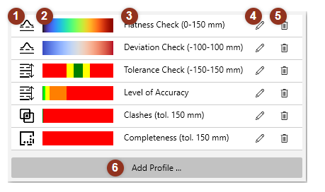
(1) Color map symbol
|
|
Flatness Check Evaluates the evenness of surfaces such as floors, walls, or ceilings by showing distance variations between the point cloud and model planes. |
|
|
Tolerance Check Highlights areas that exceed defined tolerance limits using a traffic-light color scheme, making it easy to identify in- and out-of-tolerance regions. |
|
|
Completeness Check Identifies scanned areas not covered by the model geometry, helping detect missing or unmodeled elements in as-built verification workflows. |
|
|
Clash Detection Reveals where modeled geometry overlaps with the point cloud beyond acceptable limits, useful for detecting construction conflicts or misalignments. |


(2) Color Gradient
Displays the active color scale used for the selected analysis type. It visually represents how distance or deviation values are mapped to colors in the current Quality Analysis view.
(3) Name
Displays the active color scale used for the selected analysis type. It visually represents how distance or deviation values are mapped to colors in the current Quality Analysis view.
(4) Edit Icon
Opens the color map editor, where you can adjust the gradient, distance range, and thresholds or define new color transitions for custom analyses.
(5) Delete Icon
Removes the color map from the list. This action deletes the profile from the local configuration but does not affect active visualizations until refreshed.
(6) Add Profile Button
Opens the color map editor to create a new color map profile. You can define a name, distance range, and gradient to suit specific analysis types, such as completeness or tolerance checks.
Color Map Editor
When adding a new color map or by choosing the pencil symbol  behind an existing one, the Color Map Editor window opens, and you can define the properties of the color map, including the color gradient and the range (minimum, maximum).
The Units for the minimum and maximum values are always specified in Millimeters [mm] or Inches [in], depending on the Revit project unit.
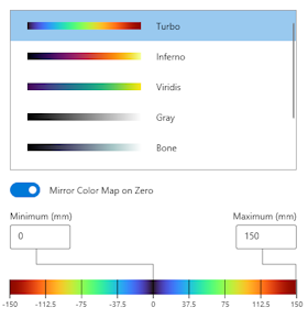
Select a color gradient from the list and specify the minimum and maximum distance values.
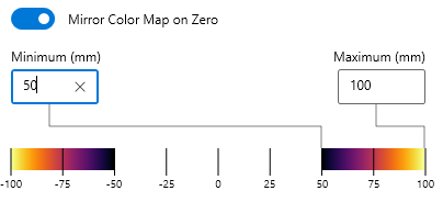
If Mirror Color Map on Zero is enabled, the minimum value must be non-negative (≥ 0). In this mode, positive and negative deviations (points lying above or below the surface) are treated symmetrically, and only the absolute distance values are used for coloring. If you set the minimum value to a number greater than zero, you can hide all points whose absolute distance is less than the minimum value, in this example 50 mm:
Color Maps - Deep Dive
For flatness analysis, soft, multi-colored gradients (e.g., Turbo) or diverging color maps (e.g., cool-to-warm) are recommended, as they fluidly represent the topography (peaks and valleys) of the surface. Color gradients suitable for flatness analysis are marked with the symbol 
Recommended Color Maps for Flatness Checks
| Color Gradient | Name | |
|
|
Turbo | “Rainbow Colors.” Developed by Google as an improved alternative to “Jet.” Turbo retains the vibrant, high-contrast colors of the rainbow to make fine details visible, but without sudden changes in brightness that can cause edges to appear. Note: It is not completely perceptually uniform and is not colorblind-safe. |
|
|
Inferno (1) (2) |
Smoothly transitions from black through fiery reds and oranges to bright yellow. It is highly effective for highlighting high-intensity data in heatmaps while remaining colorblind-friendly and printing well in grayscale. |
|
|
Viridis (1) (2) | Smoothly transitions from dark purple through blue and green to bright yellow. It is specifically designed to be colorblind-friendly and perfectly legible when printed in grayscale, making it a highly reliable standard for scientific data visualization. |
|
|
Gray (2) | Visualizes the distances without distracting color associations. |
|
|
Bone (2) | Grayscale-based colormap with a subtle blue and warm gray tint that progresses from black to white. It is the standard choice for medical imaging (like X-rays and MRIs) - that's where name comes from - because its slight coloration is easier on the eyes than pure grayscale. |
|
|
Red-White-Blue | Red-white-blue is a classic diverging colormap that transitions from deep red through a pure white center to deep blue. It is ideal for flat 2D visualizations where you want a critical midpoint (like zero) to fade into a white background, heavily emphasizing extreme positive and negative anomalies. |
|
|
Cool to Warm (1) (2) | Cool-to-warm is a diverging colormap that shifts from cool blue to warm red through a desaturated, neutral light gray rather than pure white. This design prevents middle data values from washing out or confusing the eye when compared to white background. |







(1) Perceptually uniform, meaning that equal numerical changes in distance are perceived by the human eye as equally sized changes in color and brightness.
(2) Color-blind friendly, meaning that individuals with color vision deficiencies can accurately distinguish data values by relying primarily on steady changes in brightness rather than problematic color contrasts like red and green.
Diverging color charts (Red-White-Blue, Cool to Warm) are typically created with symmetrical boundaries, e.g., min = -20 mm, max = +20 mm. This means that values around zero are displayed in the respective neutral color, white (red-white-blue) or light gray (cool-to-warm).